

When I was in the US recently I got my hands on the Urban Decay Gwen Stefani palette and since have absolutely fallen in love with it.
How can you not adore a collaboration between one of the most amazing brands in terms of eyeshadow quality and a celebrity makeup icon.
Read on for my thoughts on the palette, my favourite shadows and of course, swatches.


The buttery formulation stays in line with the usual high quality and pigmentation of Urban Decay. Trust me, it doesn't take much of these shadows to achieve an intense eye look so less product is definitely more.


From L to R: Blonde, Bathwater, Punk, Stark, Zone, Harajuku, Danger and 1987.
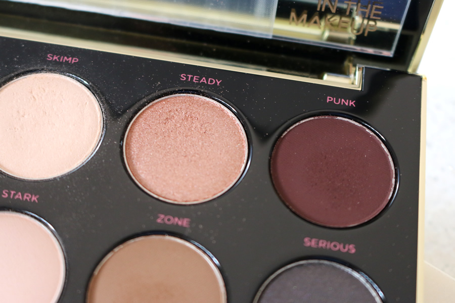
Steady is a gorgeous rose gold based nude shade with a lovely shimmery base. This one looks great in the crease or all over the lid.
Punk is a unique deep plum hue. It's matte finish makes it versatile for matte or shimmer eye looks.

Pop is an intensley shimmery champagne shade with a bit of a rose gold hint and Harajuku is a beautiful browny taupe shade.


So that's an overview, review, swatches and favourite picks from the Urban Decay Gwen Stefani palette. I have not loved a palette this much in a long time and it mainly comes down to the versatility of it. It's one of those palettes that works perfectly for everyday of the week. You have the neutrals for the work days and the pops of colour and deeper tones for nights out and weekends.
Thanks for reading!
